6 Examples of UI/UX Design Mistakes and How to Avoid Them

Hi, this is Diana Bartkowiak, UX/UI designer working at Synebo. Today, the demand for professionals is growing, and Jooble gets more and more offers for designers every day. However, the bigger market, the bigger competition. To stand out, you need to be a real expert, and today we’ll help you be the one.
This article will shed light on some apparent mistakes that professionals usually make when implementing user interface and user experience design. Specifically, you will have an opportunity to entangle various design tips that would be very useful in creating a modern and friendly UI/UX. So get ready for the images stream!
Solution №1: Group similar
Let’s start from a common situation when the form to fill in is enormously prominent, making developers and users want to die
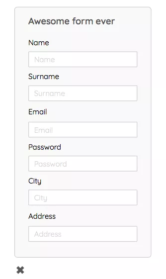
The triсk is very simple. First, you have to split the form into two logically related blocks. For example, personal information in one block, information about an account in another block, and so on ad infinitum, depending on how long the form is to be done.
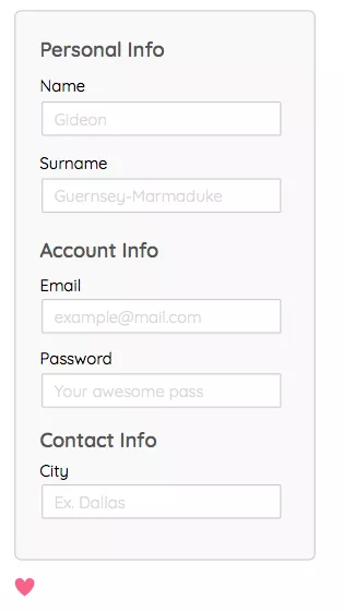
The mini-lifehack! The form will be easier to comprehend if you align the labels, not to the center of the structure but at the same time apply the principle of “group similar” to them. Well, of course, it would be great not to forget about examples in placeholders. But, again, this is a manifestation of concern about users.
Group similar (more!)
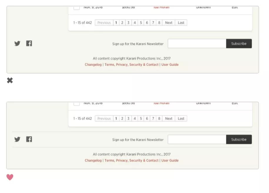
It works almost according to the same principle, but the relationship may seem less obvious. However, generally speaking, this is just a super-cool design feature. Doesn’t сlient like a business card? Voila! He likes it with the one-pixel line. Does the text on the banner look boring? Once again, the line makes it look different. When you have to split some information from each other, of course, the line will help you in this overpowering mission.
Solution №2: Create a horizontal list
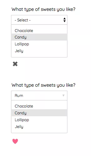
Selection is a painful topic. You need to offer a user to select necessary information. Nonetheless, it would be great to do this less painfully, isn’t it? One excellent solution for this issue is currently used even in Lightning, which is a horizontal select. Usually, it works in case there are no more than five options. Anyway, it’s worth it.
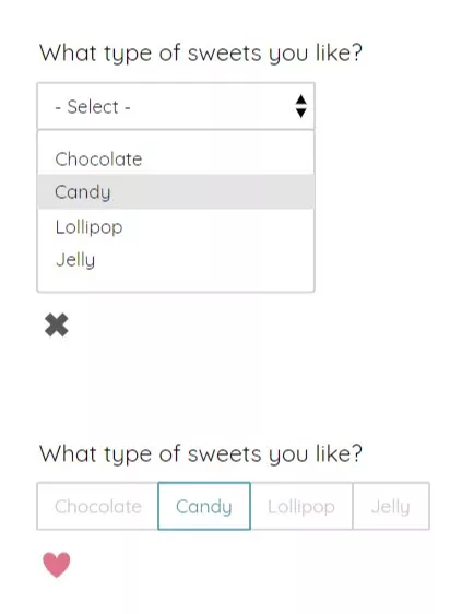
When life forces you to use a drop-down, there is still a possibility to simplify the user’s life. Regarding other input fields, you may use the same method when designing. What about a field for a “city”? For instance, you may offer a user to choose the capital of the selected country. At the same time, this placeholder will be the most advantageous in this case.
Solution №3: Focus on the leading element
I had a very gifted trainee at my previous job, who made a banner of “incredible beauty” when I was absent. After this incident, a very capacious expression, “crazy carnival,” appeared in our everyday life. You can only imagine how awful this banner was.
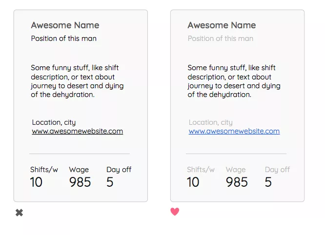
In fact, everything is effortless. There is just one crucial element, and the rest is only complementary. Only one catchy and colored piece should be illustrated. The rest is … less flashy.

Color accents quickly help to understand information or realize what kind of action is required at the moment, which, accordingly, reduces cognitive stress. This would be very useful, especially in our complex, oversaturated information era.

Here is another example of color hierarchy that shows how without reducing the font and making something LARGE or BOLD, highlight elements or make them secondary instead.
Solution №4: The correct alignment
Or how to make a table look fantastic and not die in agony

First of all, to get rid of torment, it is necessary to remember that secondary elements can be represented in a lighter style and won’t be an eyesore anymore.
And, of course, you don’t have to do alignment throughout the table. Some columns are more readable with alignment to the side.
From this example, the names of employees are aligned to the left side. Sometimes reading and comprehending with the proper alignment is more convenient. For example, skimming through the column with sums makes it much easier to distinguish the smallest or the most considerable amount in the second example.
“Dates” can also be made easier for perception if you make them look decent. And if they are responsible for different sorts of information, you should also consider and reflect this – as in the example, one of the dates is a deadline, and the other is the date of adding a record.
When they look the same, you have to think about each line, comparing and picking out the information. This slows down the process of reading the table and shortens the life of users. But, of course, you can use this knowledge if you hate people.
Well, the cherry on top is the carnival itself … you should refuse using it with no regrets, leaving the interaction only on the required line.

Solution №5: Diversify your UI buttons
Let’s imagine that we have an interface. In this interface, users can register, make an order, send a request, or whatever.
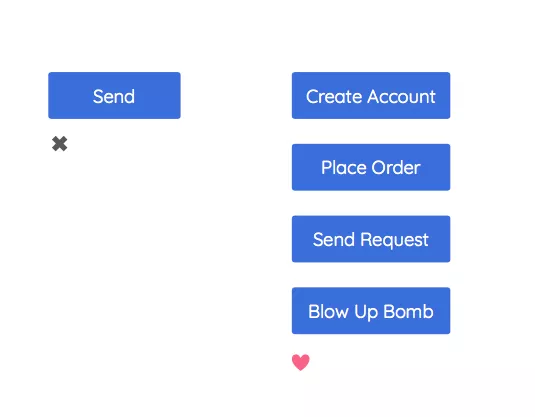
And after all, there is only one button, “send,” for all these purposes. It’s not nice… Yes, indeed, it’s not pleasant. But you can always do it well. First, you have to tell the user what will happen next.
What will he achieve by clicking on this button? What can he expect from filling out the form? He may create his account in a database. That’s what we put in our UI. You do not have to think up anything unless you are a copywriter, and you generate the coolest micro-texts that increase the button’s conversion by 300%.
I do not know what about you, but I am not that kind of copywriter. So, therefore, I use the simple method I’ve just described.
Solution №6: Focus on what matters
In the built-in text editor on Mac, the toolbar usually does not fit into the screen in width. And the brilliant solution is … not to consider this a problem.

Very often, during the development process, we spend a lot of time thinking about some details, which can be insignificant. Therefore, facing these problems and the necessity to provide some unique solution for them, it is worthwhile first to see what will happen if nothing to done about it.
Nonetheless, it helps to get rid of unnecessary stress. In addition, almost all the time, it works. Well… at least for Apple. As regards the Empty States, you may check it here.
Final Thoughts
That’s it! Now you can consider yourself as a guru of UI/UX design. If you have any questions, leave the comment below or email us at contact@synebo.io.
All links on sources check in our presentation on Slideshare.


